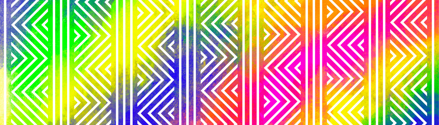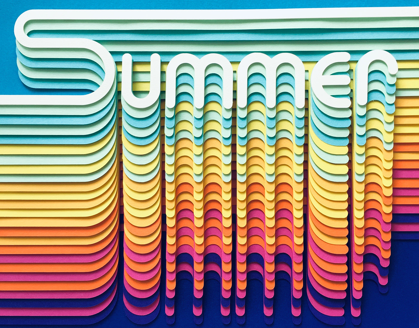
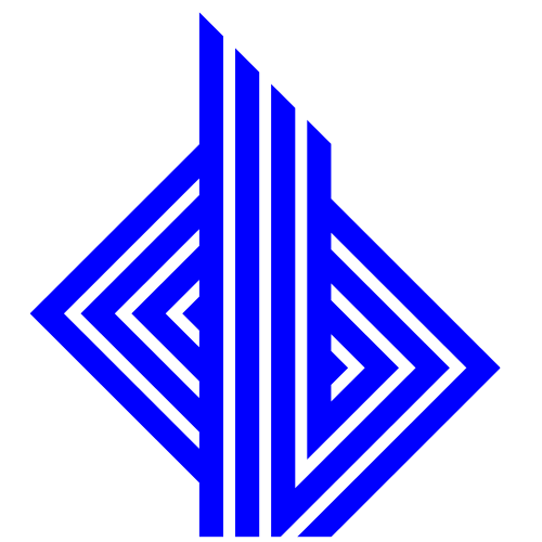
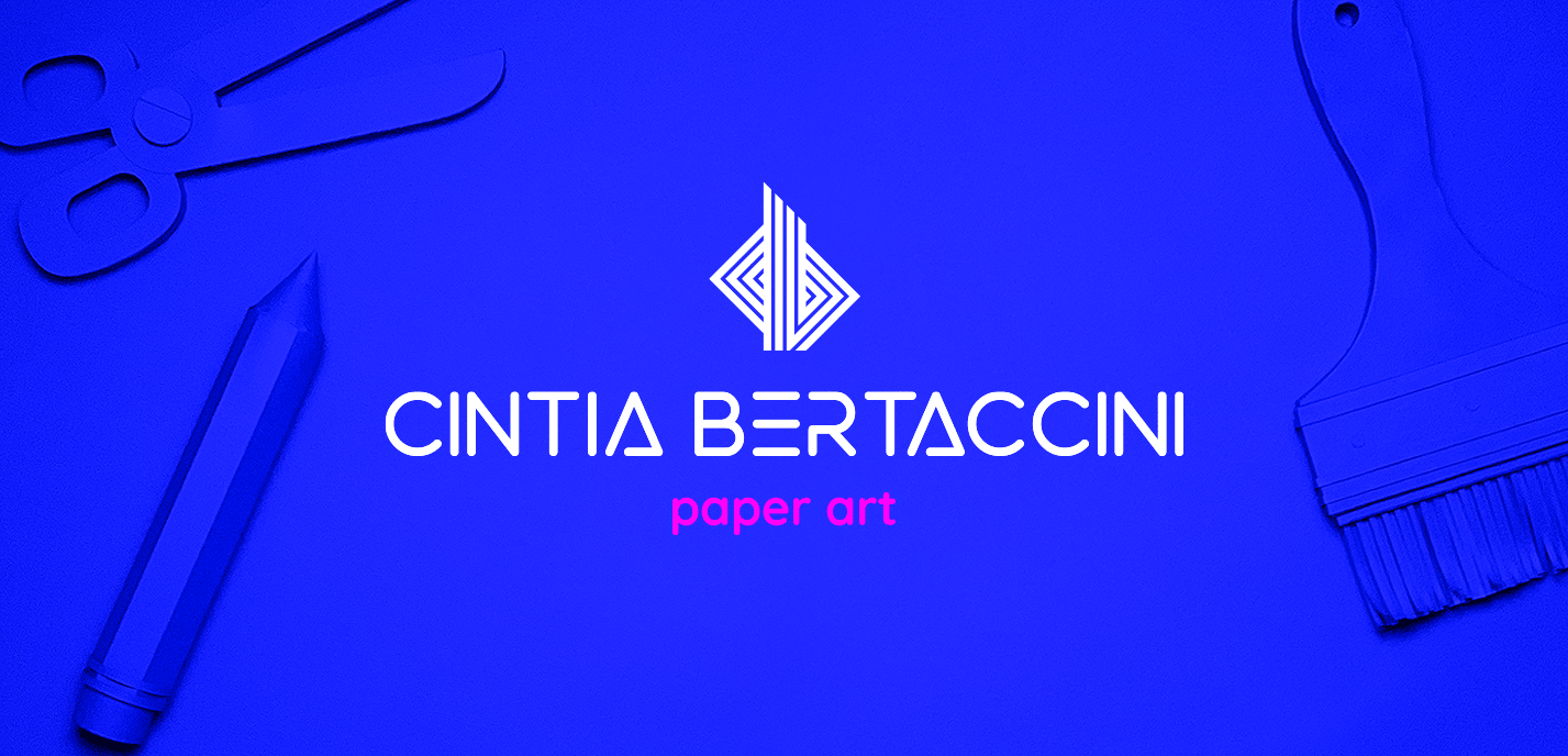
This logo explores the intersection of form and function through a simple folding gesture.
Built from the initials C and B, it's lines follow the logic of origami folds, hinting at motion, transformation and a love for precision.
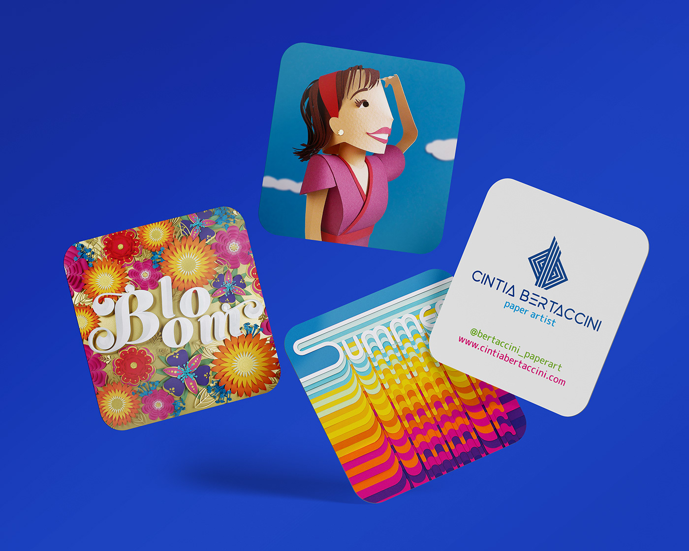
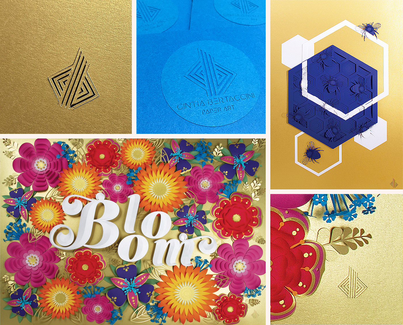
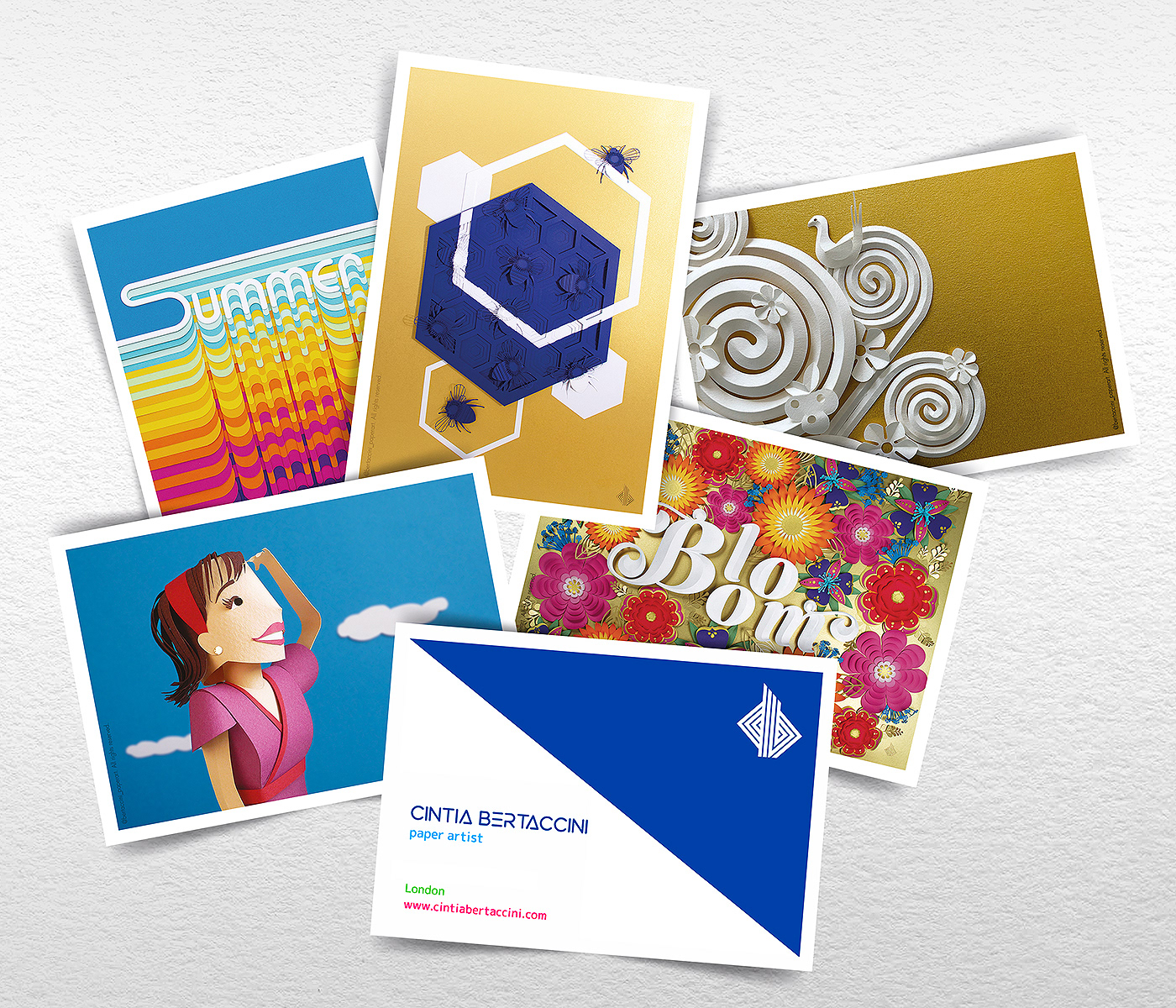
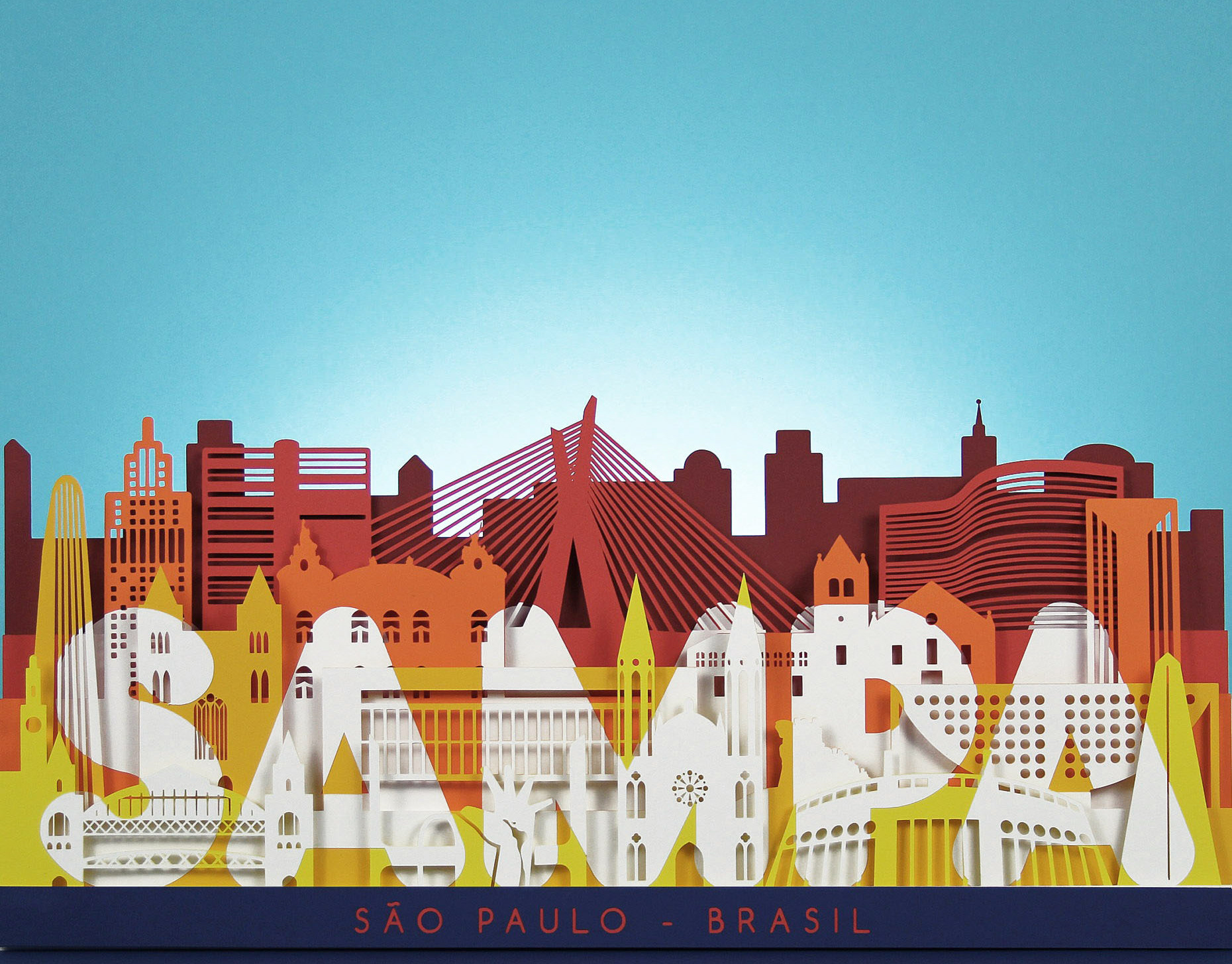
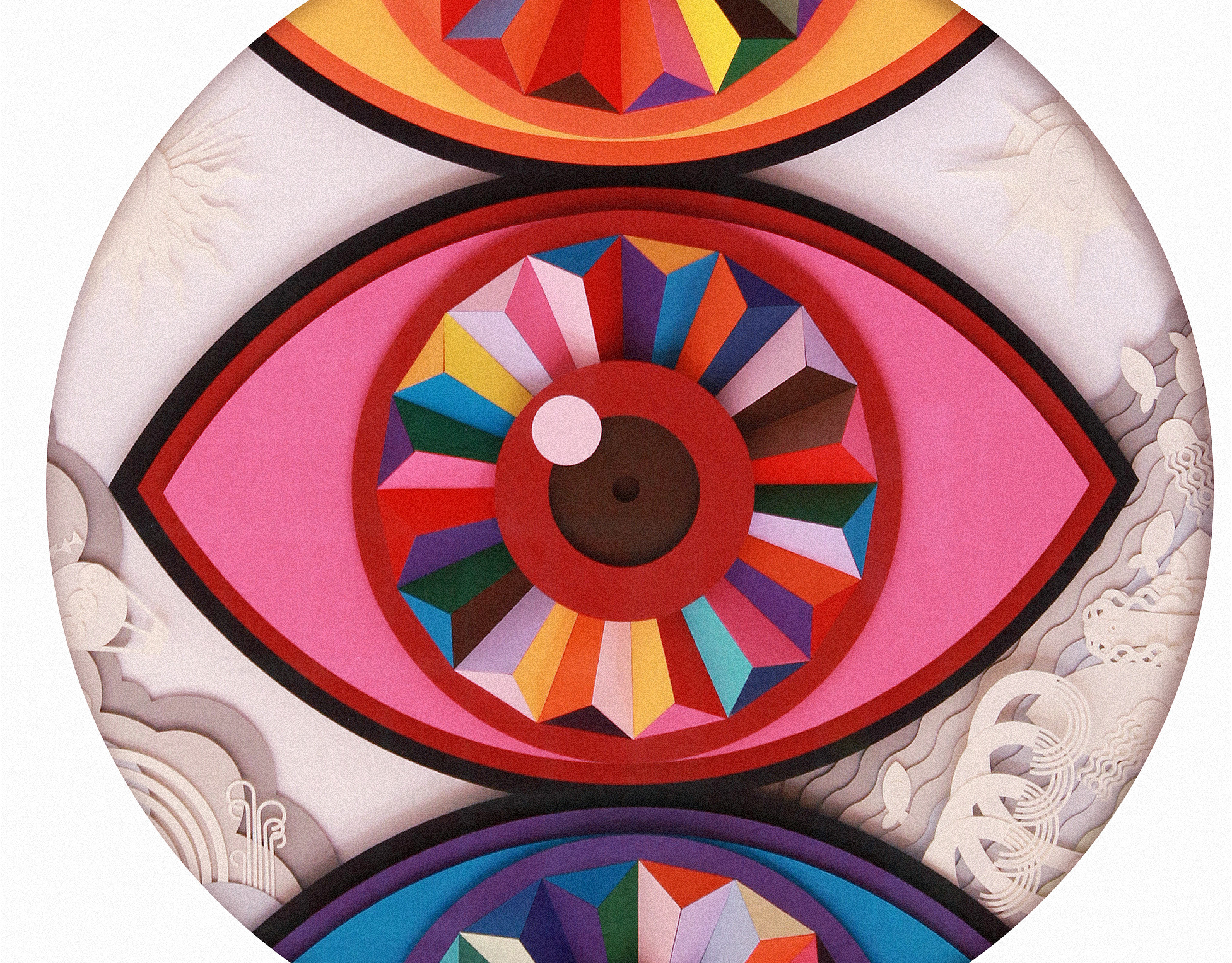
It refers to my background as a paper artist and graphic designer.
The color palette centers on a bold indigo blue that keeps things grounded, paired with neon pink, green, yellow and orange, for a splash of energy and playful disruption.
• • • • •
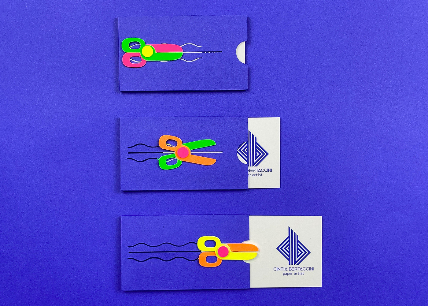
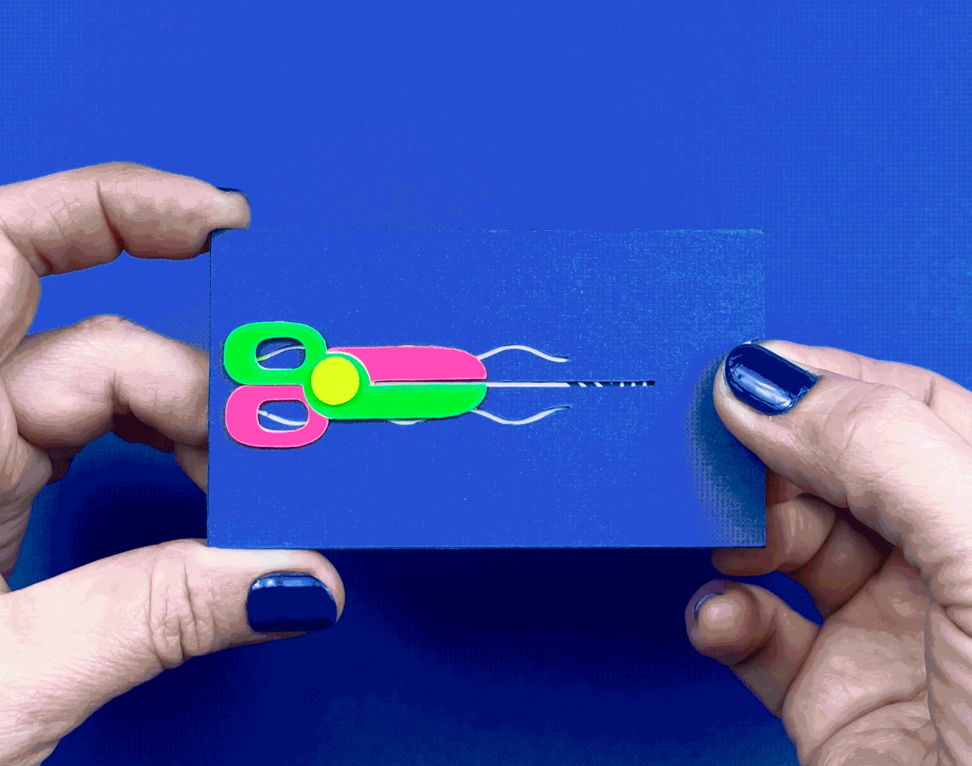
Taking inspiration from traditional hanko stamps in Japanese prints and classic artist monograms, this identity works both as a logo and a personal signature.
It's something you can fold, stamp, cut, repeat or sculpt. Designed to be responsive across platforms, it ties together all the colorful threads of my multidisciplinary work.
It's something you can fold, stamp, cut, repeat or sculpt. Designed to be responsive across platforms, it ties together all the colorful threads of my multidisciplinary work.